
A Shopping App for NYC Vintage Stores

NYC Vintage App
NYC Vintage is a thrifting app created for a thrift business in Seattle, WA. The owner reached out to me to design an app for her in anticipation of building a brick-and-mortar store. The app aims to revolutionize the thrift shopping experience by offering advanced search functionality, in-person fitting options, and personalized recommendations, ensuring users effortlessly discover and purchase items.
Roles
User Experience Designer
User Researcher
User Interface Designer
Deliverables
Competitive Analysis
User Personas
User Journey-Map
Lo-Fi Wireframes
User Research
Final Wireframes
Specs
Length: 6 weeks
Tools:
Balsamiq
Figma
Mural
The Problems
Vintage sizing is often a lot smaller than the current sizing standards.
It is often hard to find what you are looking for without taking a long time to look through the inventory because of the large variety of items that are sold in second-hand stores. This means that customers who are in a hurry generally do not buy second-hand items.
It is nearly impossible to be sure that an item will fit because of the inconsistency in sizing when buying vintage items online.
Product Goals
Users will not have to sift through a large inventory to find something that fits. They will be able to create a profile with their unique measurements and view items that fit those measurements.
Users will be able to easily find items that fit their preferred style through filter clothes by category (evening wear, streetwear, luxury wear, etc.).
Users will be able to confirm that the products fit them. Because second-hand items can often be sized differently than current sizing standards, a customer will also have the option to book a fitting room at one of the New York locations during the purchase process and try-on their items before committing to them.
Understanding the Space
Competitive Analysis
& User Research
A market research analysis was conducted to identify existing thrifting apps and their key features. My focus was to unravel the intricacies of existing thrifting apps and discern the features that resonate with users. The primary goal was to comprehend why users gravitate towards certain apps, identify the features that hold importance for them, and unveil gaps in the services currently available.
To achieve this, I collected survey responses from 4 dedicated thrifting app users, offering a broad overview. Subsequently, I engaged in 5 user interviews, aiming to extract more detailed perspectives. Synthesizing these user-driven insights and recognizing recurring patterns led to the following insights:


ThredUp
Sells a variety of thrifted goods at all price points.
A user receives an initial payment for their item but does not have influence in the selling process.
Poshmark
Users can sell their items directly and set their desired prices.
Users are responsible for the shipping of products.
Feature Analysis
User Research: Key Findings
1. 5/9 respondents reported using a thrift app to find an item before finding it at full retail price.
Competitive Analysis

2. All respondents reported dissatisfaction with the ability to appropriately size an item of clothing on a thrift app.
The Real Real
Specializes in luxury retail thrift products.
Items are authenticated.
Accepts a limited amount of merchandise.
A user receives an initial payment for their item but does not have influence in the selling process.

3. 6/9 respondents reported frustration with shipping and pick up times.
Understanding the User
After gathering and analyzing data I created 2 behavioral archetypes. These would serve as a guide throughout my design process to ground the data I had gathered through market and user research. I knew that I needed to make sure that I was designing for these users so that the result would be useful to the target audience.
User Personas

-
Age: 23Education: Bachelors, Communications
Hometown: Colombus, OH
Family: None
Occupation: Waitress
Carly just graduated with a communications degree. She decided to take a waitressing job to make money and live on her own. She doesn’t have a lot of control over her work schedule which keeps her stressed. She likes to keep up with trends but does not have the time or money to know what is currently in style.
Goals
Find cute clothes at a reasonable price
Lessen the stress of the shopping experience as their job is a large source of stress
Frustrations
“The selection at vintage stores can be overwhelming so I wish there was a way to pre-shop the store.”
“ I wish there were more curated sections in stores to keep up with trends without me having to think about it.”

-
Age: 54
Education: Masters of Interior Design
Hometown: Boston, MA
Family: Partner and Dog
Occupation: Interior Designer
Adnaan is an interior designer who lives with his husband in NYC. Adnaan tries to be stylish, especially for his job, as he believes it helps curate professionalism as an interior designer. He is also interested in fashion in general and wants to be able to easily find designer, work-appropriate pieces without having to spend hours in store.
Goals
Find unique, statement pieces for work and going out
Add a bit of variety and fun to their closet without breaking the bank
Frustrations
“Vintage stores are often curated to appease the more feminine customer. I am interested in fun pieces too.”
“I am interested in designer pieces and wish there was an easier way to find them instead of having to spend hours combing through the racks.”
User Journey Maps
To better understand the motivations behind user actions and emotions, I mapped Carly’s and Adnaan’s user journeys and flows. Mapping their decisions allowed me to uncover critical moments where users may experience frustration or confusion, leading to potential drop-offs from the app.
Persona: Carly
Goal: Lessen the stress of shopping while finding cute clothes at a reasonable price

Persona: Adnaan
Goal: Find a new jacket for an event for his interior design business

Feature Roadmap
From the major frustrations that the interviewees expressed and competitive research, I landed on the main features that this MVP would have. Due to the limited time constraint, my client and I strategized the features that would be the most important in version 1.

Flowchart
I planned out the content structure based on the client’s priorities. This helped me to make sure I maintained a straight-forward hierarchy of information that would feel intuitive for the user. Additionally, this served as a reference point for the next design steps and iterations.
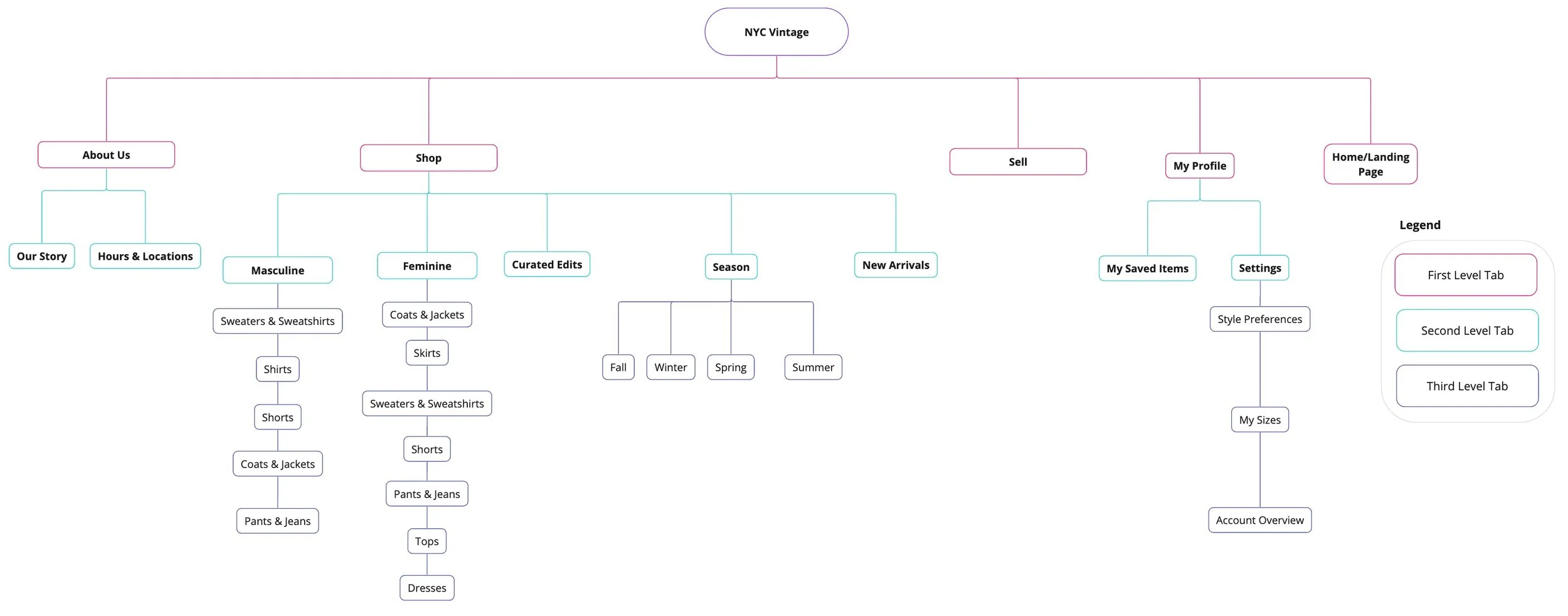
I identified optimal design patterns for NYC Vintage's interface, prioritizing user-centric wireframes with intuitive navigation, clear hierarchy, and streamlined interactions. This process also uncovered versatile screen types for consistent functionality across the app.

Categories: I included seasonal categories for more specific search options
Product Description Page

Profile Pages


Try-On: a user can schedule a try on at one of the brick-and-mortar stores before they take the clothes home with them.
Product List Pages
Recommendations: each user is given a curated recommendations page. This reduces time scrolling through items that are not a user’s personal style.
Favorites: Users can save items for purchase later.

Size Confirmation: A user will be shown a size confirmation icon if their profile measurements match the measurements of the garment.
Condition Details: a customer can make sure that a potential purchase is a piece of good quality. I added a description section to the item listing so that any imperfections could be noted.
Style Preferences: a user can add style preferences so that they are shown items that match what they are looking for
Size: adding a user’s size measurement in numerics will enable the fit you feature which reduces the likelihood that they will purchase a garment that doesn’t fit.
Saved card: a user can save their card to profile- reducing checkout time

Purchase Pages

Low-Fi Wireframes
Style Guide
I created a quick style guide for reference. I chose a muted gold and red to evoke a 70’s feel yet stay contemporary with brighter hues.


Ideation 1
Ideation 1
Some key screens I presented to users for the first ideation session.
Create a profile that is tailored to you.
2. Add further filtering to find and save curated vintage items.
3. Put checkout into easily understandable steps.
Results- Key Takeaways
I conducted multiple, rapid ideation sessions to get the feel of what the app might look like. I also did this to be able to put it in front of users and get feedback. From the user testing I discerned 3 Key Takeaways.
Try It Out!
The final design emphasized key elements that users had expressed would be helpful throughout the research process and address the client and user's pain points. Creating a tailored profile allows users to find more relevant items quickly, try-on options eliminate guesswork, and the ability to add further filters translates a user's mental model while thrift shopping to an in-app experience.
“The layout is clean, and I am able to find what I want easily.”
-R.T.
“I would totally use this! I love the price comparison feature, so I know how much of a deal I am getting by shopping second-hand.”
-M.G.
“The app feels very curated to users who often shop vintage.”
-A.K.
Final Reviews
Learnings
Conducting usability testing of the original app design proved to be instrumental in the design choices for the redesign. For example, all users struggled with the menu, which made it a clear pain point that needed to be addressed.
Users appreciate an experience that feels personalized. Allowing a user to save their settings and create a profile eases future use of the app and creates a sense of loyalty.
Users prefer navigation components that are familiar to them from other vintage apps (for example: specific sorting and filters). Sometimes modeling a design off of an existing component will allow one to use their existing heuristics for ease of use.